
How to Use the SDV3™ Dashboard
Overview
SDV3™ is a dashboard showing the Value, Volume, and Vulnerability of your sensitive data sorted by various criteria.
- Value:
- A measure of each data type's value (ordinal or monetary), as set on the "Data Types" page under Settings > Global Data Types.
- You can use ordinal or monetary value per item. (This is a required setting.)
- For value scores, see "Data Type Value Scoring" below. Also see Global Data Types
- Set your Data Type Values based on your business requirements.
- Volume:
- The total number of Asset matches identified as the result of a scan.
- Example: A scan discovers 8,000 social security numbers in various locations across your environment
- The "Type" and/or "Category" of scan can be used to manage Volume and mitigate risk.
- Vulnerability:
- Vulnerability is a reflection of an Asset's security posture.
- The "Security Measures" applied to an asset as part of your organization's security requirements reduce Vulnerability, down from 100 on a scale of 100 to 0.
What is Risk Valuation?
- Various measures of Risk Valuation are calculated and displayed in various charts and graphs shown in the SDV3™ dashboard
- This valuation shows how vulnerable your environment is in any particular data asset
- Data Type Scoring
- See Data Type Value Scoring below for value settings.
- Risk Valuation - What is acceptable?
- Your business requirements determine what is, and what is not an acceptable valuation.
Data Type Value Scoring
- (Ordinal) scale ranges from 0 (no risk) to 300 (very high risk).
- Monetary scale (in dollars) default values are taken from various reports such as the IBM data breach report, Gartner, and Ponemon.
- For example, the Social Security number data type is set to a dollar value of 165 ($165.00 per Social Security number instance).
- Ordinal and Monetary (in USD) values are set on the "Data Types" page (Settings > Global Data Types). See the screenshots below.
Data Type List - Social Security Number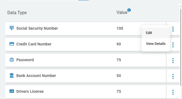
Social Security Number - Edit Data Type - Values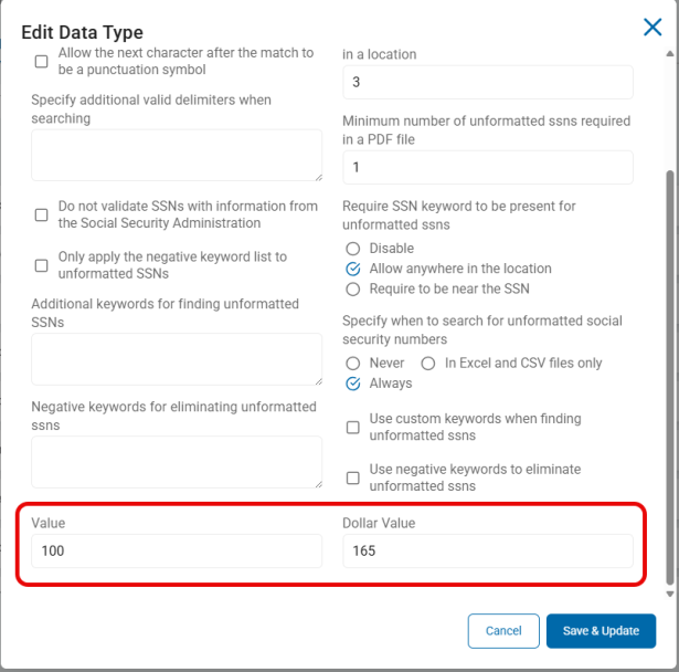
How to Access the SDV3 Dashboard
Use the following steps to access the SDV3 dashboard:
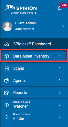
- From the left side navigation menu, click Data Asset Inventory.
- The SDV3 dashboard opens.
- Three different graphs are displayed:
- Top Data Asset Risk
- Top 10 Highest Impact Assets
- Total Risk
- The data in all three charts can be displayed in either ordinal or monetary values, using the toggle switch at the top of the page.
- To move between value types, slide the toggle switch.
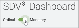
- To move between value types, slide the toggle switch.
Top Data Asset Risk
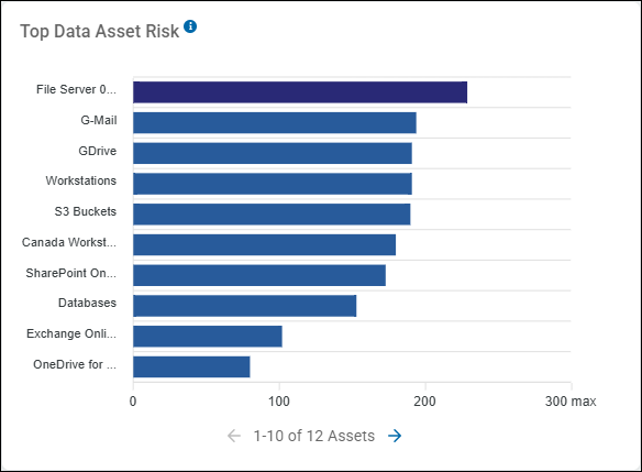
The Top Data Asset Risk bar graph is a ranking visualization in the SDV3 Dashboard that identifies which specific assets or asset groups carry the highest total risk score. This enables security teams to prioritize their remediation efforts on the systems that pose the greatest threat to the organization.
- Scores range from 0 (low risk) to 300 (very high risk)
- Hover over an data asset to view the asset's SDV3 value.
Here is a breakdown of the graph's components:
1. The Axes
- Y-Axis (Labels):
- Lists the names of the assets or asset groups (for example, File Server 0..., G-Mail, GDrive, Workstations).
- These represent the different storage locations or platforms being scanned.
- X-Axis (Risk Score):
- Represents the numerical risk value, ranging from 0 to a maximum of 300 in this view.
- This score is a composite metric calculated by Spirion based on the volume of sensitive data found, the sensitivity of the data types (for example, Social Security numbers vs. Phone Numbers), and the vulnerability of the asset.
2. The Bars and Colors
- Bar Length:
- The length of each horizontal bar corresponds to the total risk score for that asset.
- Longer bars indicate higher risk.
- Colors:
- Dark Blue (Top Bar): The top-ranked asset (File Server 001 in the example image above) is highlighted in a darker blue. This visual cue draws immediate attention to the #1 risk source in the environment.
- Standard Blue: The remaining assets are shown in a consistent blue color, ranked in descending order of risk.
3. Key Assets in the Example Image, above
- File Server 0...: This is the highest-risk asset with a score of approximately 230. It is the primary candidate for immediate remediation playbooks.
- G-Mail, GDrive, and Workstations: These three assets have very similar risk profiles, each scoring just under 200.
- OneDrive for Business: This asset has the lowest risk score in the top 10 list (approximately 80), suggesting it either contains less sensitive data or has better security controls in place compared to the others.
Summary of Use
This graph is primarily used for Operational Prioritization. While other charts might show total match counts, this graph translates those matches into a Risk Score.
A Security Administrator would use this to say: "Even if our Workstations have more total files, our File Server has a higher Risk Score due to the sensitivity of the data found there. We will focus our remediation efforts on the File Server first."
Data Asset Risk Examples
SDV3 scores are used to populate the charts and graphs on the SDV3 Dashboard
- In the example below 12 data assets are captured (10 shown), including Email servers, Amazon S3 buckets, a collection of local Workstations, Databases, etc.
- The bottom of the bar graph displays "1-10 of 12 Assets"
- Note the following about these examples:
- File Server 001 - In the example below data asset File Server 001 has the highest risk, with a total Ordinal risk score of 229 (out of 300):
- Value - 73
- Volume - 58
- Vulnerability - 98
- Risk = 229 (73+58+98)
- File Server 001 has a total Monetary value of $39,658,200!
- The sensitive data on the File Server 001 data asset requires Remediation as soon as possible!
Data Asset Risk by Monetary Amount
- Note the Monetary example below with pink bars - "Example - Top Data Asset Risk - Monetary"
- The data asset with the highest Monetary value at risk is a file server named "File Server 001," which contains nearly 40 million dollars of data risk!
- Note that oridnal data asset risk does not necessarily align with monetary asset risk:
- Workstations:
- 4th in Ordinal Data Asset Risk (score of 191)
- 2nd in Monetary Asset Risk!
- Workstations have a Monetary value of $14,750,576!
- The sensitive data on both the data assets "File Server 001" and "Workstations" requires Remediation as soon as possible!
- All Data Asset Risk should be completely remediated or kept as low as possible
- Click the right arrow at the bottom of the chart to view additional Assets
Example - Top Data Asset Risk - Ordinal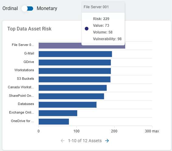
Example - Top Data Asset Risk - Monetary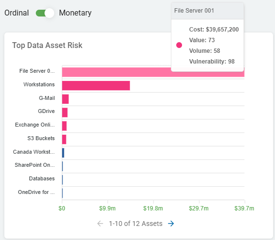
Risk Posed by Assets - Top 10 Highest Impact Assets
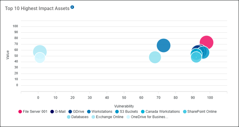
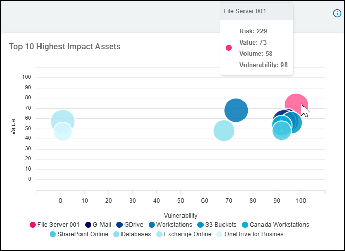
The Top 10 Highest Impact Assets graph is a bubble chart that visualizes risk by plotting specific assets (or asset groups) based on their Vulnerability and the Value of the data they contain. This helps organizations identify which specific systems represent the greatest potential impact if compromised.
Here is a breakdown of the graph's components:
Ordinal vs Monetary:
- Ordinal: Uses a relative scoring system. Scores range from 0 (low impact) to 100 (high impact). See example screenshot below
- Monetary: Uses USD currency ($), from 0-unlimited
1. The Axes
- X-Axis (Vulnerability): Represents the vulnerability score of the asset (0 to 100). A higher score on this axis indicates that the asset has more security weaknesses, such as unencrypted sensitive data, broad access permissions, or a lack of managed controls.
- Y-Axis (Value): Represents the sensitivity or "Value" of the data residing on that asset (0 to 100). This is calculated based on the volume and type of sensitive data found (for example, an asset with 10,000 SSNs has a higher Value than one with 10,000 Phone Numbers).
2. The Bubbles
- Bubble Position:
- The most critical assets are those in the top-right quadrant (High Value + High Vulnerability).
- These are the "Highest Impact" assets because they contain highly sensitive data and are poorly secured.
- Bubble Size:
- The size of the bubble typically represents the total volume of sensitive data matches or the relative risk score found on that specific asset.
- Larger Bubbles: Indicate a higher concentration of sensitive data (for example, an asset with millions of Social Security Numbers or Credit Card matches).
- Smaller Bubbles: Indicate a lower volume of sensitive data matches relative to the other assets in the Top 10 list.
- Why Bubble Size Matters
- The bubble size adds a third dimension of risk to the graph:
- X-Axis (Vulnerability): How "unsecured" the asset is.
- Y-Axis (Value): How "sensitive" the data types are.
- Bubble Size (Volume): How "much" sensitive data is actually there.
- For example, in the example image above, File Server 001 (the Alert Pink bubble) is not only the most vulnerable and high-value asset, but it also has one of the largest bubble sizes. This tells a Security Admin that this single server contains a massive amount of highly sensitive, poorly secured data, making it the #1 priority for remediation.
- Colors:
- Each color corresponds to a specific asset or asset group listed in the legend at the bottom.
3. Key Assets in this Image
- File Server 001 (Alert Pink Bubble): This is the highest-impact asset shown. It is positioned at the far top-right (Vulnerability ~98, Value ~75), meaning it contains very high-value data and is extremely vulnerable.
- G-Mail & GDrive (Dark Blue Bubbles): These are also in the high-risk cluster on the right, indicating significant exposure in cloud collaboration tools.
- OneDrive for Business (Light Blue Bubble): This asset is positioned on the far left (Vulnerability ~0). This suggests that while it contains sensitive data (Value ~50), it is considered "secure" or has low vulnerability according to the current security posture.
Summary of Use
This graph is used by Security Administrators to prioritize their "To-Do" list.
- Immediate Action: Focus on the assets in the top-right (like File Server 001). These are the most vulnerable, highest-risk assets, and require Remediation
- Strategic Monitoring: Assets on the left (like OneDrive) are currently secure, but their high "Value" means they should be monitored closely to ensure their vulnerability score doesn't increase.
- Hover over a data asset to view the SDV3 value (Ordinal or Monetary).
Top 10 Highest Impact Assets Example - Highest Impact Asset
Total Risk - What is it and How is it measured?
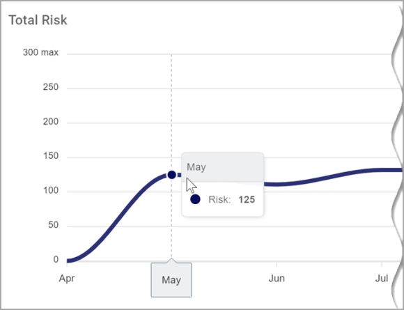
Total Risk represents the overall total Risk score for your entire organization over time.
- The risk of all of your data assets is combined and averaged to create the Total Risk Score.
- Ordinal score ranges from 0 (no risk) to 300 (very high risk)
- Monetary score shown in USD ($), ranges from 0 to unlimited
- Hover over a data point to view the total risk score for that time period.
Note: See Example Data Asset Inventory Setup for sample setup instructions
Total Risk Over Time - Optimal Trend vs. Observed Trend
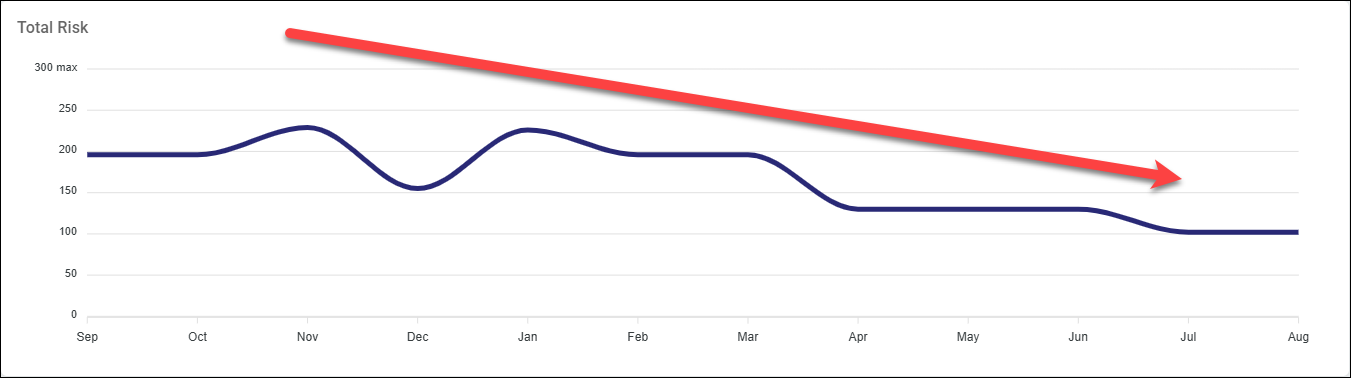
Note that Total Risk measurements over time in the SDV3 Dashboard should not increase over time - this indicates that the amount of sensitive data in your organization and the risk imposed by that data, is growing. This INCREASES the odds of a data breach as well as the total impact of such a breach.
- Total Risk rising over time is a warning
- Investigate to determine if any of the following is true:
- Your organization has added assets without proper controls
- Changes in your organization have resulted in existing assets no longer being subject to proper security controls
- Changes to your IT policies (such as email or other data archiving) have caused gaps in data security
- New personnel do not follow proper data security protocols
- Take steps to keep your Total Risk score as low as possible, and trending downward over time.
Total Risk over time in your organization should trend down, as shown in graph below:
How to Investigate Risk Assets
Once you identify your riskiest assets, archTIS recommends you remediate the sensitive data at risk. First, learn more about the assets that contain the sensitive data. There are multiple ways to do this. The steps below represent one possible path to take:
- From the left-side navigation menu, select "Data Asset Inventory > Data Assets and Targets."
- The "Data Assets and Targets" page opens. The ASSETS tab is selected, by default.
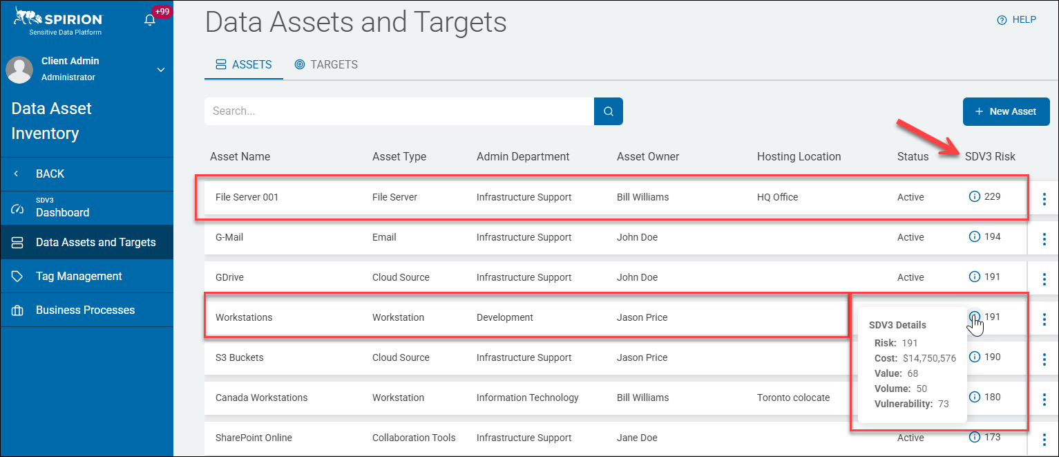
- Sort the table shown by the desired column. Sort by SDV3 Risk at far right to bring the riskiest assets to the top of the table.
- The data assets identified in the example above, "File Server 001," and "Workstations," are shown in the table of assets, sorted by SDV3 Risk, in the screenshot below. The 'i' info icon reveals more information.
- Select an asset and from the more options menu at the far right of the table row select "View Asset Details."
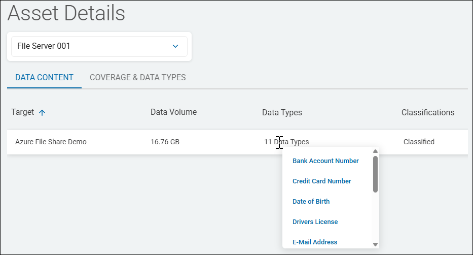
- The Asset Details page opens with the DATA CONTENT tab selected, by default. See the "Asset Details" screenshot below.
Note: Depending on your goals, multiple paths to reduce data exposure or improve your data asset risk posture are possible. This example provides one scenario, but your specific path will vary depending on your specific needs.
Asset Details
Detailed Scoring Breakdown: Value, Volume, Vulnerability
SDV3™ is a dashboard showing the Value, Volume, and Vulnerability of your sensitive data sorted by various criteria.
- Below is a detailed breakdown of the calculation of the 3 V's - Value, Volume, and Vulnerability.
Value
The value of your sensitive data (data assets) is calculated using the amount and weighting of the sensitive data.
- The number (quantity) of each asset is multiplied by its weight to yield the total value of the asset itself.
- All asset total values are then summed to yield a Total data value, or Value score.
Example:
- 10 social security numbers (SSNs) with a weight of 10 = an SSN value of 100 (10 x 10)
- 5 credit card numbers (CCNs) with a value of 50 = 250, (5 x 50)
- The Asset data value total = 350, (100 + 250)
- Subsequently, the Asset Value receives a score based on the Total Asset Data Value.
- This normalizes the number for a simpler SDV3™ Risk score.
- Total data value (TDV) = Value score (V1)
Volume
Total number of matches receives a total count score which indicates the Asset's Volume.
- The total count score is normalized in a scale of 1-100 and becomes the Asset Volume Score.
- Total matches (TM), normalized on a score of 1-100 = Volume score (V2)
Vulnerability
Total number of matches receives a total count score which indicates the Asset's Volume.
- Each variable is given a score.
- The values for both variables (Asset Type and Security Measures) are assigned a base score by the user in the Asset section of the Data Asset Inventory in SDP.
- The total of these values is the Vulnerability Score (V3):
- Asset Type (AT) + Security (SP) = Vulnerability Score (V3)
*All data is normalized to fit a scale of 1-100
*All data is calculated from the results of the LAST COMPLETED SCAN